
Printing your word clouds brings a whole new level of fun. It’s one thing to use them digitally and see them on your screen, but seeing them on paper, merchandise, or gift items can really make them useful. With WordCloud.app, you can easily print your creations and make them a unique gift, office decor, or promotional item. Let’s explore how to get your word cloud ready for print!
What Makes a Word Cloud Good for Printing?
Not all word clouds that look great on screen will print well. A printable word cloud needs to be high resolution, have clear fonts, and use colors suited for printing. Here’s what to consider:
- Image size and resolution: A small image will appear pixelated or blurry when printed. Larger resolutions (e.g., 3000x3000px or more) ensure sharp prints.
- Font size and readability: Tiny words that look fine on screen may be unreadable in print. Make sure the smallest words remain legible.
- Color choices: Colors on a screen (RGB) may look different in print (CMYK). High-contrast colors work best, and gradients can be tricky.
- Background considerations: Transparent backgrounds are useful for printing on colored surfaces, like tote bags or T-shirts.
- Margins and bleed: Avoid placing important words too close to the edges, especially for posters or framed prints.
These factors help ensure your word cloud looks just as good in print as it does digitally.
1. Margins and Bleed
When printing a word cloud, leaving enough space around the edges is crucial to avoid cutting off important words. Here’s how to ensure a well-balanced layout:
- Use the “Scale” option in the Shapes section to shrink the word cloud slightly, leaving a margin around it.
- Consider bleed if printing professionally. Some printers require extra space beyond the final cut size to prevent white edges. Check your print service’s bleed recommendations.
- For framed prints or posters, keep key words away from the edges to avoid them being cropped or hidden under a frame.
- For merchandise like mugs or T-shirts, ensure words don’t sit too close to seams, edges, or folds.
A well-planned layout helps your word cloud print cleanly without losing important details.
See all layout features available in WordCloud.app
2. Choosing the Right Resolution for Different Prints
DPI (dots per inch) determines print quality. A higher DPI means a sharper print, while a low DPI can make an image look pixelated.
- 300 DPI – Standard for high-quality prints (posters, T-shirts, merchandise).
- 150 DPI – Acceptable for larger prints viewed from a distance (banners, billboards).
- 72 DPI – Only suitable for screens, not for printing.
To get the best print quality, multiply the print size (in inches) by the required DPI to get the pixel dimensions. For example, if you need to print a 10x10cm image at 300 DPI, convert 10cm to inches (3.9 inch), then multiply that by 300 (1170px).
Quick resolution guide:
| What you are printing | Optimal resolution | Notes |
|---|---|---|
| Mugs, stickers, postcards | 1200×1200 px | At 300 DPI this will make a good quality 4×4 inch or about 10×10 cm print |
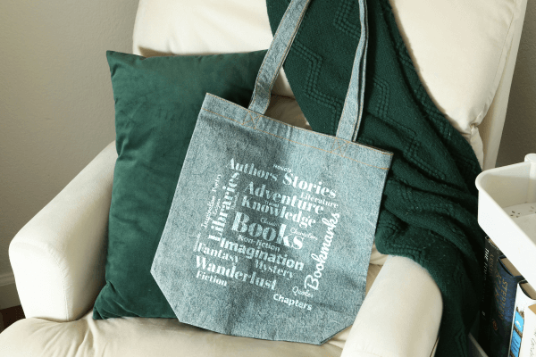
| T-shirts, tote bags, A4 posters | 2000×2000 px | At 150-300 DPI this will make a 7 to 13 inch or 17 to 34 cm print. |
| Large posters, banners | 4000×4000 px | This is suitable for printing up to 1m and even more. |
Extra tips:
- Never enlarge a small image — it will lose sharpness.
- If you are uploading an image background, make sure it has good resolution, too.
- If you are printing through a professional service, check their image size and DPI recommendations.
3. Colors for Printing: What to Consider
When designing a word cloud for print, it’s essential to consider how colors will appear once the word cloud is printed. Colors that look great on a screen might not translate the same way when printed. Here’s what to keep in mind:
Screen vs. Print Colors
Colors displayed on screens are typically created using the RGB (Red, Green, Blue) color model, which combines light to create colors. However, printing uses a different color model called CMYK (Cyan, Magenta, Yellow, Black). The two models can produce different results, which is why a vibrant color on your screen may appear dull or different when printed.
Color Contrast and Readability
For printed word clouds, high contrast between the text and background is crucial. When choosing colors for your word cloud:
- Avoid using similar shades for text and background, as this can reduce readability.
- Opt for bold, high-contrast combinations (e.g., dark text on a light background or vice versa) to ensure your word cloud remains clear.
Gradients and Print Quality
While gradients look great on screens, they can sometimes create issues when printed, especially on fabric. Printing gradients with CMYK can cause them to appear less smooth and more blocky. If you plan to use a gradient, consider using a high-resolution image to minimize the quality loss when printing.
Black-and-White vs. Color Printing
If you’re printing in black-and-white, you’ll want to adjust your word cloud’s colors before exporting. Bright, contrasting colors can be challenging to reproduce in grayscale, so using shades of gray or high-contrast black and white text will ensure clarity.
If you’re printing in color, remember that colors that seem vibrant on screen might appear muted or less intense when printed, particularly on materials like paper or fabric. Test prints can help you adjust your color choices before proceeding with larger quantities.
Printing on Colored Backgrounds
When printing your word cloud on a colored background (like a blue tote bag or a black T-shirt), make sure the colors you’ve chosen for your text will stand out. For dark-colored backgrounds, use light text colors to ensure your word cloud remains legible. For light-colored backgrounds, darker text colors will work better.
Lastly, consider using transparent backgrounds for printing. This will allow your word cloud to blend seamlessly onto the print medium, without a harsh border around it, which is especially useful for apparel and tote bags.
Learn about the color palette features available in WordCloud.app
4. Best File Format for Printing Word Clouds
For printing, the best file format for your word cloud is PNG. This format preserves the quality of your image without losing fonts or details. PNG also supports transparent backgrounds, making it ideal for printing on different-colored materials. Avoid using JPEG, as it can compress the image and degrade quality. Always export your word cloud as a high-resolution PNG to ensure sharp, clear prints.
5. What Can You Print a Word Cloud On?
Word clouds can go beyond paper. Here are some fun ideas for things to print your word cloud on:
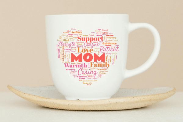
- Mugs – Perfect for personalized gifts or corporate swag.
- Tote Bags – A great option for everyday use or as a gift.
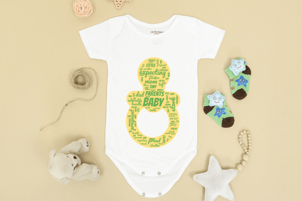
- T-shirts – Add a unique design to any casual outfit.
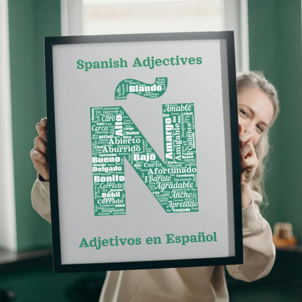
- Posters – Ideal for office decor or event promotions.
- Phone Cases – A fun way to customize your phone.
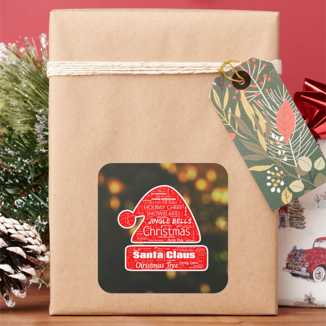
- Stickers – Easy to put on laptops, water bottles, or notebooks.
- Calendars – A creative way to mark special occasions throughout the year.
These are just a few ideas, but word clouds can be printed on almost anything. From gifts to business promotions, the options are nearly limitless.
Ready to make a word cloud? Go to your Dashboard and start for free right now!
Related Posts


